


Please read the previous post "is my site mobile friendly? (Part 1)" before reading this post.
Cross Platform Friendly Links and Effects
It is hard not to include a nifty hover tooltip or a drop down navigation or even links that open up a small new window using javascript to display some information. However, to a user on a mobile device, these effects and tools may not work on their platform, leaving many unusable links and tools. An easy solution to this is to always provide an alternative for users who cannot view or use them.
Some mobile devices allow Javascript but it will not be able to utilize the effects you have on your website anyway, so the best thing to do is to detect the type of platform that is connected to your website and disabling or changing some tools and effects to suit it better.
Keep Your Content Compact
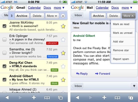
Long pages for mobile devices are definitely a huge draw back because of the longer load time it takes to download the webpage. Therefore, keeping your web pages content compact makes your website accessible across all platforms even on a device that has a very limited download speed, thus, the last thing users want to be doing is waiting for pages to load rather than spend the time browsing through it.
Large and Clear Content
If your website’s content and links are not large or clear enough, navigating through your website will be a pain.

Keep it Simple
make sure your website has a short and easy to remember domain. Additionally, eliminating typing work as much as possible to get around while they are on your website is also ideal, as usually they are accessing your site to quickly pull or reference information.

No comments:
Post a Comment