


How Did We Get Here? - Dive Into HTML5:
'via Blog this'

Popular Posts
-
Please read the previous post "is my site mobile friendly? (Part 1)" before reading this post. Cross Platform Friendly Links an...
-
Now that mobile browsing is ever increasing in popularity, it is in your best interest to start optimizing your websites to bette...
-
How Did We Get Here? - Dive Into HTML5 : 'via Blog this'
-
It is just numerical ranking value between (0 to 10) which is provided by Google search engine to show the quality of websites. Google Page ...
-
Once you’ve decided that you’re ready to get started with mobile advertising, you first need to define who are you advertising to, and the ...
-
 CPC ads (an abbreviation from Cost Per Click) are different from CPM because with CPC you get paid not when visitors view ads but when they ...
 -
 "iPhone" without its Apps! will you be interested to buy? Thanks that there are loads of apps in so called "Apps Store"....
 -
Social media marketing (SMM) refers to utilization of special tools as well as techniques in building effective relationships online. The st...
-
 Youtube is kinda like Google, people search for something and expect to get results (in this case videos)related to the keywords they used....
 -
Click Here to know more! Facebook’s growth is NO surprise…with media outlets raving about it and it hitting the forefront of the internet… ...
Sunday, August 28, 2011

Tuesday, February 22, 2011
is my site mobile friendly? (Part 2)

Please read the previous post "is my site mobile friendly? (Part 1)" before reading this post.
Cross Platform Friendly Links and Effects
It is hard not to include a nifty hover tooltip or a drop down navigation or even links that open up a small new window using javascript to display some information. However, to a user on a mobile device, these effects and tools may not work on their platform, leaving many unusable links and tools. An easy solution to this is to always provide an alternative for users who cannot view or use them.
Some mobile devices allow Javascript but it will not be able to utilize the effects you have on your website anyway, so the best thing to do is to detect the type of platform that is connected to your website and disabling or changing some tools and effects to suit it better.
Keep Your Content Compact
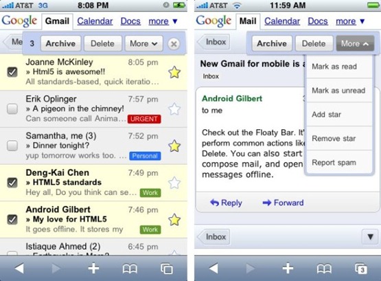
Long pages for mobile devices are definitely a huge draw back because of the longer load time it takes to download the webpage. Therefore, keeping your web pages content compact makes your website accessible across all platforms even on a device that has a very limited download speed, thus, the last thing users want to be doing is waiting for pages to load rather than spend the time browsing through it.
Large and Clear Content
If your website’s content and links are not large or clear enough, navigating through your website will be a pain.

Keep it Simple
make sure your website has a short and easy to remember domain. Additionally, eliminating typing work as much as possible to get around while they are on your website is also ideal, as usually they are accessing your site to quickly pull or reference information.
Wednesday, February 2, 2011
is my site mobile friendly? (Part 1)

Now that mobile browsing is ever increasing in popularity, it is in your best interest to start optimizing your websites to better fit the mobile platform and its limitations. There are many easy ways to enhance you website for mobile browsing without hindering much of your website; we discuss eight popular ones that can make a huge impact on usability.
In this article I'll introduce some fundamental steps that, will help you avoid the pitfalls that have caused many other mobile sites to fail. By the end of this article you'll know exactly where to focus your efforts in order to build a successful mobile site.
For our purposes, we divided all mobile devices into three categories.
1. Devices with screens that have widths between 320 and 480 pixels, that support CSS, and that support screen media types and media queries. This includes the iPhone, the G1 and many Android devices. We will refer to this group collectively as the iPhone. These devices will be able to support all of the optimizations we put in place.
2. Devices that support CSS and that either support the handheld media type or support the screen media type and media queries and have screens smaller than 320px wide. We'll create separate, simplified CSS rules for these devices since their screen size will limit what they are able to display.
3. Devices that don't support CSS. These devices will render our content from the markup only. We don't have to provide any special optimizations for this group. Since our CMS allows us to use HTML standards, it will still render effectively on these devices.
Monday, January 24, 2011
How to Create an Advertisement for Mobile Devices

Once you’ve decided that you’re ready to get started with mobile advertising, you first need to define who are you advertising to, and the device that they will be using to see your ad. You will need to set up a different type of campaign for a customer that is using a smartphone (think mini computer like the iPhone or Android), then you would for a customer using a feature (WAP) phone.
So what’s the difference between phones? Though there is no current definition of a smartphone, they are phones with full Internet browser capabilities. On the other hand, a Wireless Application Protocol (WAP) phone can connect to the Internet, but the browser is not as complex, and is geared to fit in the smaller screen of a phone. So what does this mean for you? As I mentioned before, you need to identify who your audience is, and the device they will be using when they see your ad.
A campaign for a smartphone will contain standard size ads, while a WAP campaign will contain mobile ads that are smaller, and will direct users to a mobile website. A mobile website is basically a copy of your current site that has been rewritten in a mobile markup language. There are a variety of mark up languages, and it is important that you know the type you have used when setting up your campaign. You can start here to learn more about developing mobile sites.
Tuesday, January 11, 2011
Making Money Today Armed with A Simple Tool & A FREE Facebook™ Account!
 Click Here to know more!
Facebook’s growth is NO surprise…with media outlets raving about it and it hitting the forefront of the internet…
In fact it gets so much exposure that it surpasses 100 Billion website hits most days…
What’s even BETTER is that most people think Facebook is just a place for YOUNG PEOPLE…The truth is that Facebook’s fastest growing demographic right now are those between the ages of 30 – 40.
Facebook also is here to stay with hundreds of thousands of websites integrating with it as well as half of all Facebook users logging in EVERY DAY…
Facebook is bigger than just a SOCIAL NETWORK…Facebook is a global phenomenon that most people log in to every day because it’s a ROUTINE…Something they do and something they can’t live without…
You’ll be able to make money from Facebook YOURSELF or provide businesses with your new script and Facebook Marketing abilities…“Wow, Sounds like it’s packed with information” We wanted to make sure that everyone had the ABILLITY armed with this course to make $588 so heres the deal…Never made money online before…Let us CHANGE that!
 know more
This has meant that Facebook has only continued to GROW and it’s net has only widened…
What many don’t know is that there are a select number of marketers right now keeping their lips tightly sealed…
WHY?
Click Here!
Wednesday, January 5, 2011
Google page rank calculation formula

Google Page Rank Formula:
PR(A) = (1 - d) + d * SUM ((PR(I->A)/C(I))

Where:
• PR(A) is the PageRank of your page A.
• d is the damping factor, usually set to 0,85.
• PR(I->A) is the PageRank of page I containing a link to page A.
• C(I) is the number of links off page I.
• PR(I->A)/C(I) is a PR-value page A receives from page I.
• SUM (PR(I->A)/C(I)) is the sum of all PR-values page A receives from pages with links to page A.
Already we discussed above google page rank formula calculation is based on inbound and outbound links. So it is indirectly makes traffic in Search Engines.
Subscribe to:
Posts (Atom)